INDmoney · Onboarding & KYC

Two Markets, One Door

Our ad promised Indian and US stocks. Our onboarding could only send people down one road.

KYC completion 1.8x Investor conversion 1.1x 5 variants tested
See the screens
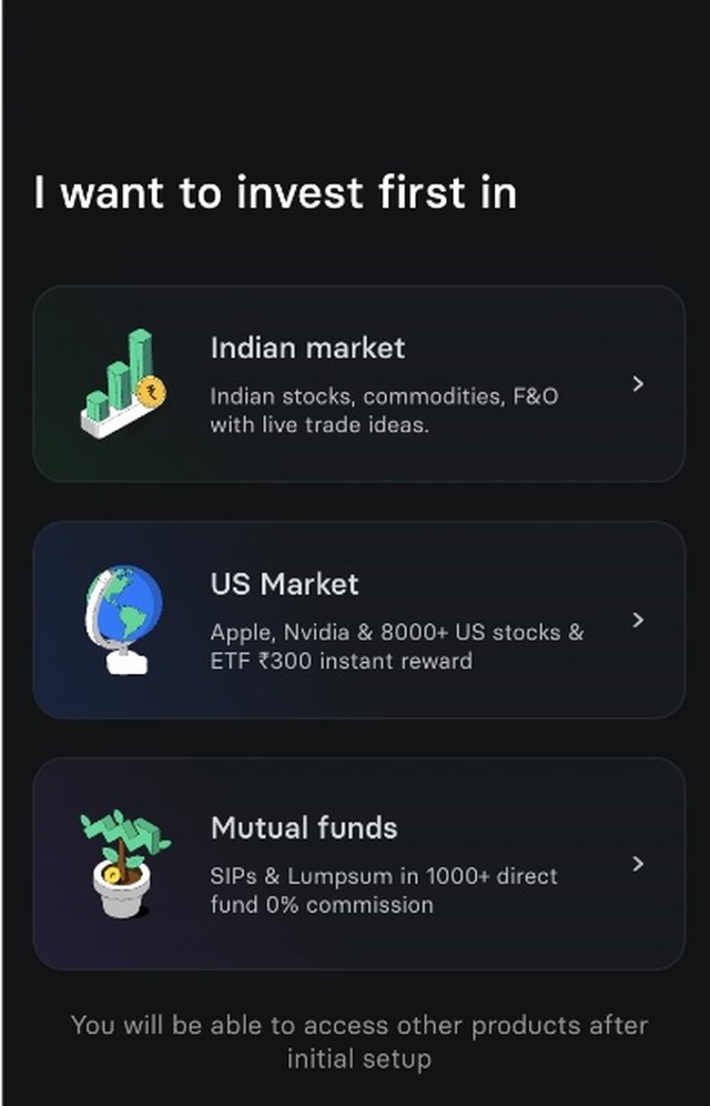
Pick Your Product screen: I want to invest first in

ACT 1 Empathize

The ad is where onboarding begins

I worked on INDmoney's onboarding and KYC team. A big part of the job was staying in lockstep with marketing: every campaign needed a journey that carried the ad's promise all the way through, so a user who tapped on "US stocks" never landed somewhere that felt unrelated.

If the first screen after an ad feels off, people don't complain. They just leave.

Until then, this was easy. Campaigns were product-specific, so the redirect wrote itself: a US stocks ad led to the US stocks journey.

ACT 2 Define

The campaign that broke the rule

Then marketing launched "Your Money Works Day & Night", promoting both Indian and US stock investing in a single message. Suddenly there was no single journey to send people to.

Every campaign before

US stocks ad→US stocks KYC

One product, one promise, one obvious path.

This campaign

Indian + US stocks ad→which KYC?

Two promises, and any path we picked would be wrong for some users.

HOW MIGHT WE

…carry a multi-product promise into onboarding, without making the choice on the user's behalf?

ACT 3 Ideate

Guess for them, or ask them

We couldn't know which market a user had in mind when they tapped the ad, and choosing for them meant some users would always land in the wrong journey.

Option A

Pick a default journey

Send everyone down one path and hope it matches.

  • No extra screen
  • Wrong for everyone who wanted the other market
  • Breaks the ad's promise
What we chose

Let users pick

Ask one simple question: where do you want to make your first investment?

  • Users route themselves correctly
  • Keeps the ad's context alive
  • Gives users a sense of control

ACT 4 Prototype

One screen, one question

We designed a screen we called Pick Your Product. It asks where you'd like to make your first investment, and your answer decides your KYC journey. Below are two of the variants we tested: one with two markets side by side, and one with three products, Indian market, US market and mutual funds, each with a line on what it offers.

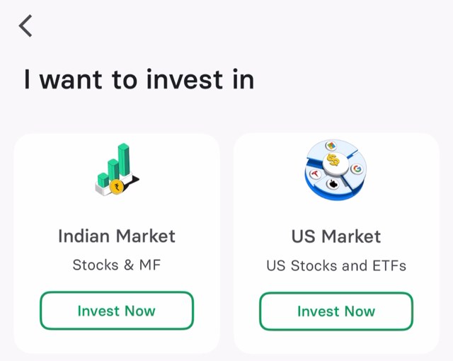
Pick Your Product variant with Indian Market and US Market cards
Variant A: two markets, side by side
Pick Your Product variant with Indian market, US Market and Mutual funds
Variant B: three products, each with a line on what it offers

ACT 5 Test

Five versions of one question

A single screen can still be built a hundred ways. We tested 5 variants, each changing what users saw while asking the same question.

🎨

Illustrations

Which visuals made each product feel clear and inviting.

✍️

Copy

How we phrased the question and described each option.

↕️

Option order

Which product sat first, second and third on the screen.

Order mattered more than it sounds. On a phone, people tend to tap whatever sits closest to their thumb. Rotating the order let us separate "users chose this" from "it was just in easy reach."

Rotating the order to rule out position bias

V1IndianUSMF
V2USIndianMF
V3MFIndianUS
V4IndianMFUS
V5USMFIndian

Illustrative orders. Each real variant also changed illustrations and copy.

ACT 6

Judging past the first tap

A variant that gets more taps but weaker investors isn't a win. So we followed every variant all the way down the funnel, from the first click to whether people stuck around.

Then came the surprise: there was no single winner. The variant that did best on Android wasn't the best on iOS.

Android

Its own winning variant, best across all metrics

iOS

A different winning variant, best across all metrics

So we shipped two: one variant for each platform.

ACT 7

What one question was worth

KYC completion

1.0x
1.8x
BeforePick Your Product

Investor conversion

1.0x
1.1x
BeforePick Your Product

Indexed to the journey before the change, on a 0–2x scale.

The screen didn't stay a one-campaign fix. Because it worked, and because users liked having the choice, we rolled it out further.

One campaign→ Other campaigns→ Organic onboarding
THE FINAL WORD

When you can't know, ask

This looked like a marketing problem: the campaign didn't fit our routing. It was really a question of who should make the choice. The moment we handed it to users, the ad's promise survived into the product, and more people finished KYC.

Read another case study Get in touch